The Weekly Gripe

Gripes the News
The Soapbox
Gripes in the pipes
*

BBC weather maps, drab and uninformative

18 comments  Add a comment

Now that the weather has warmed up a bit and were having the occasional heat wave - its time to have a gripe about something that makes me a bit hot under the collar!

How long are we going to be stuck with the deplorable BBC TV Weather Maps?  Their dull brown and beige background illustrates what appears to be a Britain a few months after a nuclear attack - not a hint of green anywhere.

very difficult to glean the details of the forecast

The effect of these drab and boring maps is that it is very difficult to glean the details of the forecast - everywhere in the country looks like everywhere else! Also, the animated symbols for rain and cloud, etc., are just plain pathetic.
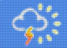
A weather map cloud graphic Sky's weather programme compared to the BBC - Clouds swirl and raindrops dance

Compare the BBC's poor performances with the superbly designed Weather Maps put out by Sky News.  Every detail of the weather is beautifully illustrated against a colourful and attractive map of the British Isles.  Clouds swirl and raindrops dance and the sun bursts through - it's a positive ballet of weather information!

Come on, BBC: you've wasted our licence money once again, but you should make amends by scrapping the present Weather Maps and get something as good as Sky News.

By: Oracle 2006


Leave a comment

First Prev 1/2 Next Last

Dr Nick Riviera

Dr Nick Riviera

It wouldn't be difficult to make a very modern map that actually resembles this country. But instead the geniuses at the BBC and now SKY, probably trying to please the Bedouin demographic, think that a desert looks best. Well it doesn't. It looks dreadful. You know that emperor, he had no cloths on - same thing here.
07/05/11 Dr Nick Riviera
-84
Stuart Westley

Stuart Westley

Completely agree, Emperor Wang, the ITV, C4 and C5 graphics are SO out of date it's untrue! Tbh, I think it's better to see something proffesionally designed by the Met Office that shows the pressure charts, the rain as almost "seas" that wash over the UK and zooms in everywhere so you get a detailed view of where you live rather then a couple of creud clouds drawn over a even more creudly drawn UK, then getting sheila's wheel's to sing me out! Even more annoying, the whole thing looks like something you could knock up in 10 mins using Paint and Powerpoint! ITV is no competition to the BBC in this department, or any, actually, I try to avoid ITV at all costs!!!
11/04/11 Stuart Westley
-96
Dr Nick Riviera

Dr Nick Riviera

Whining! You mean that thing that happens to you whenever your shoes don't match your handbag, prat.
12/11/10 Dr Nick Riviera
2
ajp

ajp

I notice that Manchester does not exist according to the BBC either. Shame really - the seat of the Industrial Revolution. Ah well, so it goes.
30/10/10 ajp
-81
Gay abandon

Gay abandon

What a whiner you are. Isn't there anything more important to do with your time than gripe about trivial stuff like this?
08/06/10 Gay abandon
-99
mike

mike

I just cannot uderstand the colours and what they are supposed to represent ,I cant be the only one, we could do with an explanatory web page or tv program
10/02/10 mike
32
Jared Anglin

Jared Anglin

I agree with fletcher lodwick, I think the maps are great and they should never change it.
20/04/09 Jared Anglin
51
reflux

reflux

Has anyone noticed how many bbc employees are in America covering the presidential election? Everyone seems to have their thumb in the pie....Question time, This week, the politics show, Hugh Edwards, David Dimbleby to name but a few. There is even a North East Politics reporter in the US following a Cumbrian MP who has decided to be there for some reason. I would like to know the cost of all this to the licence/tax payer and why the recession appears not to be affecting the BBC like the rest of us.
04/11/08 reflux
26
Emperor Wang

Emperor Wang

The 'new' BBC weather maps are the best on TV. Not an opinion. It's a fact.

A lot of the detail seems to be lost on some people - who can't get over the fact that the maps aren't green (the colour green has no special relevance to the weather) or that they move (like most other TV images).

Any accusation of 'dumbing down' indicates a lack of understanding about weather graphics in the first place. The 'new' graphics were actually dumbed 'up' - but obviously there are still some people who prefer a comically large cartoon picture of a cloud hovering over half the country in order to understand what the weather forecast is.

I notice someone earlier said the maps don't ' bear any relation to the
magnificent shades of green and brown we actually see in the landscape of the British Isles'.
Well - they're not supposed to. And nor should they. Most people understand why, but there's always going to be a few stragglers.

All weather forecasts will be presented in a similar way in the future - the BBC followed Sky in this respect. Just take a look at the woefully old-fashioned ITV weather forecasts and enjoy them while you still can.
03/09/07 Emperor Wang
-12
dommy

dommy

The Sky News Weather charts were fine until the Sky News revamp, they have since gone very messy and I cannot differentiate how heavy the rain is falling at times and sometimes those wind arrows get on my nerves. At least with the BBC charts, they are simple and clear, heavy rain is shown as colours and they show information that is appropriate.
12/08/07 dommy
-8
Mike.

Mike.

The BBC weather forecast is far superior to the short versions on ITV or sky, however I did prefer the older stile maps with the pressure charts.
27/07/07 Mike.
57
Fletcher Lodwick

Fletcher Lodwick

I agree with Bar Chewer. I think the maps are great and they should never change it.
18/05/07 Fletcher Lodwick
-95
Geoff

Geoff

Typical British whining and an underlying trend of Americanism. All worried about style and the substance comes second. Not ONE comment on how accurate the forecast is.
27/04/07 Geoff
-77
Carborundum

Carborundum

If you think that's bad, try the BBC's international weather forecasts on BBC World. We live in Portugal, a country that appears to have been renamed "weatherman's elbow" by the BBC. Yup, they stand in front of the dear motherland. Every forecast, every day, every presenter. They seem to be totally unaware of our abusive shouts, obscene geatures and hurled objects (carefully selected not to cause lasting screen damage). Why can't they stand in front of friggin' Spain one in a while?
07/11/06 Carborundum
71
Rich

Rich

It's not just the maps that is poor but the presentation. The camera and presenter lingers over Northern Ireland and Scotland (where a small proportion of the population lives) but doesn't even mention large parts of England (apart from the South West where again few people live. Also why give a detailled description of the weather during the night up till 6 a.m. in the evening bulletin. Who cares whether it is raining at 2 in the morning people want to know what the weater will be like the next day not whilst they are asleep in bed.
25/08/06 Rich
7

First Prev 1/2 Next Last

FEATURES

Gripes the News
Gripes in the pipes
The Soapbox
spinner